
For those interested I will be attending the Cincinnati Comic Expo
tomorrow Saturday September 18th.The weather looks to be great this weekend and the show is only for one day so come out and see what the show is all out then head down to Oktoberfest.
I and a host of other very talented local artists will have tables at the show.
Cincinnati Artist attending
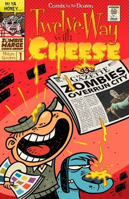
I will be selling at my table: copies of the local anthology 12-Way with Cheese, Kolchak The Nightstalker Comics, original art and a handful of prints.
Also contained within the current issue of Citybeat on newsstands I have a small article interview written by local writer Rich Shivener on my thoughts relating to comics and conventions. As with any interview it is usually cut down to only about 5% of the topics covered but all a the same I thought it was a good quick read. So for the short version running in CityBeat click this link. For those who are gluttonous for long winded manifesto here is the full written portion response to my questions.
San Diego Comic Con – how was it? What did you take from it this year? (In a material and perhaps mental sense)
This year’s con is already a blur but overall it was a great experience.
While every ComicCon has it on unique flavor this year was one of introspection for me.
This was the first year I actual put some merchandise on the table. That was an interesting experience. It really opened my eyes to what fans want as well as the profitable of moving my originals. The main function of con for me has always been to network but it was nice to make back a little money which allowed me to enjoy some nice dinners guilt free as well as pick up a few rounds.
As far as con booty is concerned, I always like to buy at least one sketch or piece of art at con to inspire me. Last year it was my Ashley Wood page and this year it was a killer Scott Hampton ink drawing. I can’t truly say how much Scott’s work has inspired me but for anyone who has not seen it, I highly suggest picking up a copy of his Upturned Stone. It is a great Halloween story with a Ray Bradbury vibe that instantly returns you to childhood wonder. Scott is a legend in sequential art and has a library of great books out there so getting an original sketch was amazing. I wish publishers were putting out more sequentially painted books, as they seem to be getting farther and few between.
The other amazing thing that happened to me at con was having the opportunity to have my work reviewed by Marshall Vandruff and Justin Sweet. Both of these gentlemen have a rare level of excellence in what they do and I was extraordinarily lucky to stumble upon them this year. More over the pair could have not been more warm and generous with their time. The further I progress in my career I find it becomes increasingly harder to get meaningful insight to help me evolve my work so when I find it, its gold. I would love to go in great detail about the insight they gave me in those 30 minutes but I could fill this whole newspaper with the words and implications of that conversation, most of which I am still wrestling with. For the sake of brevity I will leave you with this, which affected me, the most. Every thought or action translates plainly to your strokes on canvas; beware of who and what you want to be, because to the trained eye it’s all there. The confidence as well as the insecurities, your art is a mirror to you, be careful and be aware what you want to show the world. I always thought this was artiste mumbo-jumbo, I was completely wrong!
There was one other thing that really moved me from the perspective of a teacher that I thought was brilliant. When discussing a specific topic with Marshall he would address them almost as a physician would. He would label the illness and then in a calm thoughtful tone give a prescription as to relive you of the ailment. It amazed me that such a clear organized method of teaching without passing judgment has never occurred to me before. I simply can’t say enough about this experience or these two gentlemen other than, Thank You.
And finally, most importantly above all what I learned at con was that TRON is gonna freak’n ROCK!
The importance, in your opinion, of comic cons.
Conventions are a great resource for artists to have essential face time with their fan base as well as with editors and art buyers. In the ever-growing global economy engulfed by the ever-increasing sea of meta data it is essential that a professional artist make personal connections whenever possible. From a fan’s perspective it’s like Christmas. You get to deal directly with artists you love and see sneak peek of media you are passionate about. Minus the rancor of basement dwelling man-children, what’s not to love?
What cues can other con organizers take from something like SDCC?
Know your market within the region you live and exploit its traditions, values and spending habits. Every part of the US has its own wonderful flavor of originally and the good shows take advantage of this because like any good artist they know their market first. Listen to your exhibitors and attendees feedback. Too many shows that where once lovely run by passionate fans with resources have went the way of the Dodo because businessmen bought them out to make a quick buck. They quickly lose the confidence and locality of the fan base with no thought given to the longevity of the show. These show either implode leaving the region without of are taken over.
Your take on the comic – and illustrator, for a large scope – scene in the region
One thing that has always amazed me about Cincinnati is the wealth of artistic talent here, in all the arts, but particularly in the illustration community. Whether it’s the vast array of quality education institutions found in Ohio or something in the water we got talent by the boatload.
However, I will say this in terms of geography and technology, Cincinnati is very limited in terms of what we publish in this region and who buys art. If you have the notion that the days of moving to the big city to make it are obsolete because of Computing and networking technologies I would ask you to reevaluate. While the amount of talented artists that call Cincinnati their home would suggest otherwise, I see a reemergence of the “scenes” in the various artistic circles. Being or not being associated with these groups definitely has an impact on the success of one’s career. This is where the earlier topic of conventions comes in. Conventions allow artists like myself who choose to live elsewhere in the country to be part of the conversation making them an active party in charting the course of their given field. As I said before getting yourself and your artwork in front of people who have the budgets and desire to hire you is often more important than producing your art. This obvious point is often over looked in my field by the young artists.
A walkthrough of your creating process
Step 1 Preparation and Concept
The most important step in the process is the idea. Illustration is understanding the idea you want to convey and finding the best possible visual way to communicate that idea. I start with several sketches looking for the best idea. After I find the best way to communicate my idea (literal or conceptual) I need to think about design. I now know the elements of my piece, but now in thumbnails I need to figure the best way to organize the information. I keep in mind: shape, dominance, value, and color with special attention to the format of the piece. Finally I settle on a single rough draft thumbnail, which I feel best, conveys my intent.
Step 2 The Rough, Research, and Photo Layout
With the thumbnail complete I will do research followed by photo reference. I prefer to shoot most of my reference in my studio with my lights, props, and models. Now that I have shot my reference using my thumbnail as a guide I quickly cut and paste the photos in a layout in Photoshop. This layout is still subject to change but it helps me address problems I may have not yet encountered in my thumbnail.
Step 3 The Line Drawing and Reference
After I have figured out the design and my digital layout is complete, I print out photos of each aspect of the illustration separately on a white background. I draw each of the many elements as if they were spot illustrations. I use several layers of tissue or tracing paper to do my drawings; that way if there are parts I’m satisfied with I can transfer them to a fresh sheet where I will work out my problem areas. I am mindful to use the reference as exactly that and nothing more. If I have to alter or completely disregard reality for the sake of good design I will do so without hesitation. Once I have a solid line drawing for each part of my compositions I may scan them to create a line drawing to show the client.
Step 4 Transfer
The next step once the line drawing is approved is to transfer the multiple line drawings to boards using graphite paper. I use Strathmore Illustration board with a tooth or rough surface.
Step 5 Value
This is where the majority of the time consuming work begins. I create a black and white illustration with whatever medium seems to suit my needs best. Each medium has its pros and cons. Over the years I have learned these and I take advantage of all of them. I try to work one medium at a time on the each of the multiple illustrations on the boards in an assembly line fashion.
After I transfer my drawing to the boards I go over my lines with graphite or a rapidograph pen depending on my needs and the line quality I desire. Graphite, lead, combined with blending stomps are often used for bright clothing and skin tones. The key is to only apply very thin layers of pencil. Ink is used as a time saver but also as a way to get rich darks in my piece. Ink works great on black hair or jackets and even on backgrounds. I often seal this ink with a lacquer then go over it with white and grey colored pencil. A wonderful texture can be found this way for textiles and clothing. I use watercolor and acrylic interchangeable. My decision is based solely on the thought of will I later want to go back in with water to bring out highlights. If so I use watercolor, if not acrylic. I use gesso and not white paint for highlights for the thick texture it provides. I mix gesso with ink, watercolor, or acrylic to get a full range of value.
Step 6 Color and the Computer
Now that the b/w painting is complete I scan the images into Photoshop. People often ask how did you get this texture or technique with the computer? This background looks like watercolor how did you accomplish that? The answer is it looks like watercolor because it is. The work looks like it was done by hand because it was. My style is the way I draw and Photoshop allows me to transparently add color to my drawing without changing the integrity of them. The coloring process is a simple matter of making selection then filling those selections while choosing the proper combination of multiply, overlay, and color settings in the layers options. In finishing the illustration it may be necessary for me to make the edge relationship work together in the frame of reference. This is a matter of sharpening, blurring, or erasing an edge. I will also add any specific lighting effects I feel the piece needs and with that my image is complete and ready for press.
Recent works and upcoming ones
I am currently working on several projects and have a handful of books dropping this fall.
The most intensive and ambitious venture I am currently engaged in is my MFA Thesis for CCAD. The project is a sequential narrative work dealing the intimate stories of human interaction and the divine thread that connects one life to another. This project will conclude in 2013 with a published graphic novel in printed and digital format. You can find out more details about that project at The Golden Thread.
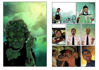
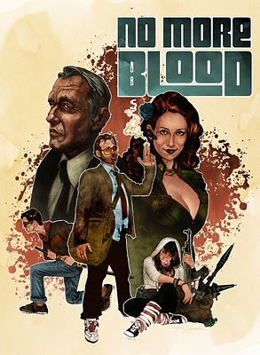
I am also part of a team working on motion graphics and promotion designs for a local filmmaker Anthony Francis Moorman. His film No More Blood is an independent action short getting ready for the film festival circuit and is in postproduction as we speak. Anthony has managed to wrangle some of the most talented actors, actresses and crew in town. The whole process has been extremely interesting and I have been simply awe struck by the level of commitment and talent working on this project. Not to mention the whole thing was shot on cutting-edge RED cameras. More information on this film can be found on the No More Blood facebook page.
As far as appearances the Cincinnati Comic Expo is this September where I will be selling comics, original art and debuting 12-Way with Cheese an anthology showcasing 12 very diverse Cincinnati artists. Later in the fall I will also tentatively be attending Mid Ohio Comic Con in Columbus.
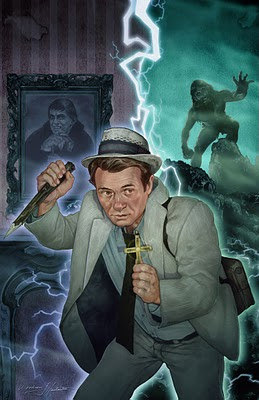
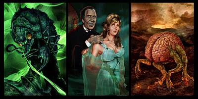
With regards to publication Spectrum 17 the Best in Contemporary Fantastic Art will be out this fall, which showcases some of my Kolchak Comic covers. Dungeons and Dragons: Monster Manual 3 from Wizards of the Coast has just been released in which I have a handful and creepy crawlers. Moonstone will be releasing two more Kolchak : the Night Stalker comics for which I do the cover illustrations in the end of Autumn. Finally I have a pretty fun interview about Good vs Evil in WANTED UNDEAD OR ALIVE: Vampire Hunters and Other Kick-Ass Enemies of Evil by Marvel author Jonathan Maberry and Janice Gable Bashman by Citadel Press.
We're in the thick of the Digital Age. What do you think the future holds for comic, comic art, and perhaps even RPG art? Is the Digital Age changing your process?
One of the most important things an artist must be aware of is his changing environment. After all art is often just one’s interpretation of the world they live in. With that in mind I have to acknowledge the changing dynamic of print in my field, to ignore it is to become obsolete. One of the latest issue of Time magazine features a large Steve Jobs head staring at you telling you why his iPad will replace the printed book in a few years. Technology for better or worse has changed the way artists interact with their audience and the world. How does this relate to a commercial market and the world of sequential art? You need only look at the new deals IDW, Marvel, and DC comics have made with Apple to exclusively launch their content on Apple’s new product the iPad to answer that question. These companies are using this new medium, but they are not taking advantage of it’s true potential.
The Golden Age illustrators of yesteryear became renowned not only by excellence in their craft but also by utilizing the new technologies available at the time, which in their day was the new full color printing press. I also intend to let new technology expedite my progress as well as enhance the way my audience views my art.
Sequential art has been a long, tried and true method of left to right viewing that has been perfected within the context of a printed book. New technologies don’t have the same workspace limitations as the printed page. We can now tell a story that goes up, down, left, right, diagonal or we can zoom in or out to infinity which adds a new dimension to the story telling aspect of the narrative. There are no limitations in terms of size, direction or flow. Specifically concerning my MFA Thesis I can further push the notion of my non-linear story and show this illusive divine thread I have mentioned by stringing the stories together on the computer like a family tree rather than a timeline. The beginning of one story can be the end of another, as well as the middle of yet a third. The entire tale is intertwined, in this way an audience can experience each story on it’s own merit but can also view the implications of each story as a whole. These concepts are clearly and eloquently explained in a book called Reinventing Comics by Scott McCloud where he critically discusses the past, present and future of sequential art.
No comments:
Post a Comment